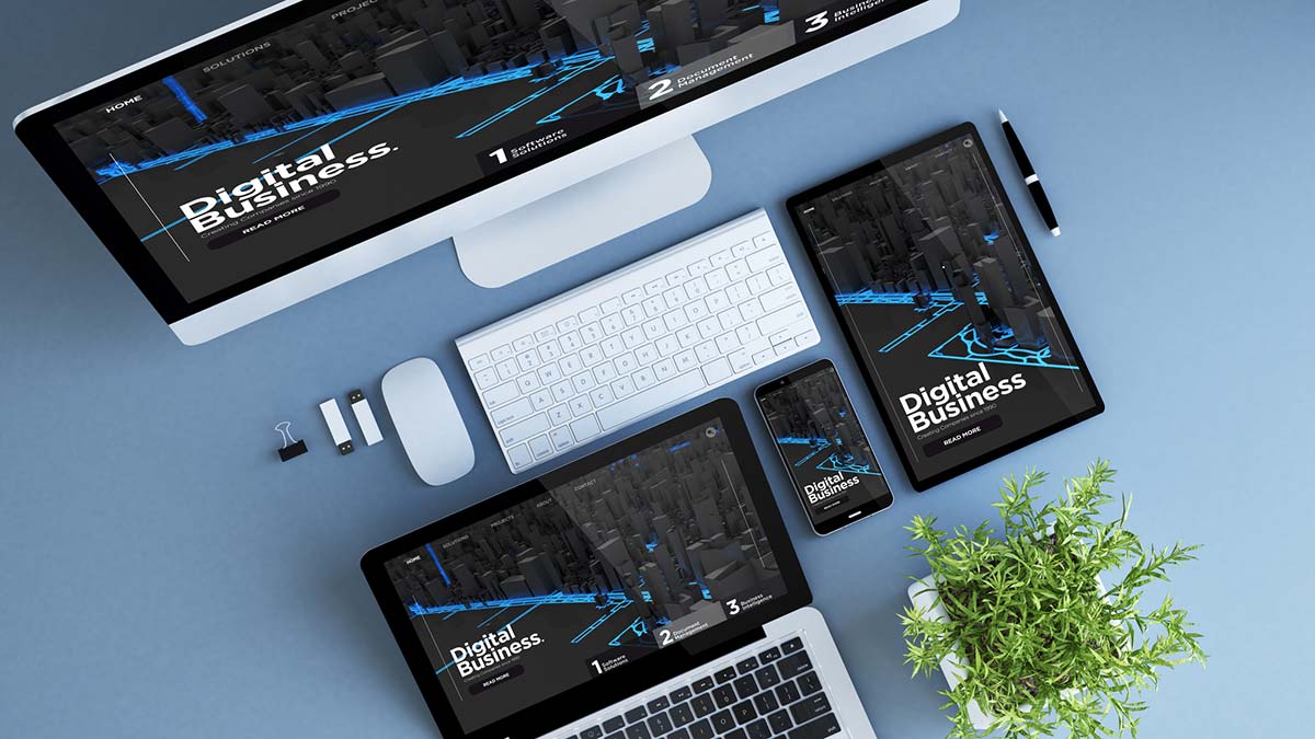
In today’s world, people access the internet on various devices, from desktop computers to smartphones and tablets. As a web developer or designer, it’s essential to ensure that your website is accessible and usable on all devices. This is where responsive design comes in.
Responsive Design?! What is it?
Responsive design is an approach to web design that ensures a website’s layout and content adapts to fit the size of the screen it’s being viewed on. This means a website will look great and be easy to use, whether viewed on a desktop, laptop, tablet, or smartphone.
Why is Responsive Design Important?
Creating a responsive design has numerous benefits for both website owners and users. In this section, we’ll cover some critical benefits of it.
Improved user experience
Responsive design ensures your site looks and functions well on any device, providing a consistent and user-friendly experience for all users. Whether someone is accessing your site from a desktop computer or a smartphone, they’ll be able to easily navigate your site, view your content without zooming or scrolling, and enjoy a seamless user experience.
Better SEO
Responsive design is crucial for improving your site’s search engine optimization (SEO). Google and other search engines push on top mobile-friendly sites in their search results, so having a responsive design can improve your site’s visibility and attract more traffic.
Increased conversions
If your site is responsive it can also help improve conversions, whether signing up for a newsletter, making a purchase, or filling out a contact form. By providing a seamless and user-friendly experience, responsive design can make it easier for users to complete their desired actions, leading to higher conversion rates.
Lower bounce rates
If your site is optimized for different devices, users are likely to stay on your site quickly, resulting in a high bounce rate. A responsive design ensures that users remain engaged with your site, reducing the bounce rate and increasing the time users spend on your site.
By prioritizing responsive design, you can ensure that your site is accessible and engaging for all users, regardless of their device.
The Basics of Responsive Design
Responsive design is a design approach that aims to create a website that looks and functions well on any device, from a desktop computer to a smartphone. This section will cover the basics, including media queries, fluid grids, and flexible images.
Media queries
Media queries are a fundamental part of responsive design. They allow you to apply different styles and layouts to your site based on the user’s screen size. With media queries, you can create a single site that adapts to any screen size, providing all website visitors a seamless and user-friendly experience. For example, apply one set of styles for screens larger than 1200 pixels and another set of styles for screens smaller than 768 pixels.
Fluid grids
Unlike fixed-width layouts, which have a set width, fluid grids are designed to be flexible and adapt to the user’s screen size. This allows you to create a layout that looks great on any device, providing a consistent and user-friendly experience.
Flexible images
Images can be a challenge when designing for multiple devices, as they can become distorted or too large on small screens. Flexible images, which can resize and adapt to the user’s screen size, help ensure your images look great on any device. This can be achieved using CSS rules such as max-width: 100%.
Mobile-first approach
A mobile-first approach is a popular strategy for creating responsive designs. With this approach, you start designing for the smallest screen size first and then work your way up to larger screens. This ensures your site is optimized for mobile users, who comprise an increasingly large portion of internet users.
By understanding these basics of responsive design, you can create a website optimized for all devices, providing a seamless and user-friendly experience for all website visitors. Whether you’re designing a new site from scratch or optimizing an existing site, responsive design is a crucial approach to ensure the success of your website.
Tips for Creating a Responsive Design
Here are some practical tips and best practices for creating a responsive design:
- Design for the Smallest Screen First:
When designing a responsive website, it’s essential to start with the smallest screen size and work your way up. This ensures that your website will be usable on all devices, regardless of screen size. - Use a Mobile-First Approach:
With more people accessing the internet on mobile devices than ever before, you have to design with mobile users in mind. A mobile-first approach involves designing for mobile devices first and then scaling up for larger screens. - Test on Multiple Devices:
Test your website on multiple devices to ensure it looks and works as intended. This includes testing on different screen sizes, operating systems, and browsers. - Focus on Usability and User Experience:
The ultimate goal of responsive design is to create a website that is easy to use and provides a great user experience. This means focusing on usability, readability, and accessibility.
The Benefits of Responsive Design
Responsive design has many benefits, including:
- Improved User Experience:
A responsive website provides a better user experience, which leads to happier users and increased engagement. - Better SEO:
Responsive websites are favored by search engines, which can lead to higher search engine rankings and more organic traffic. - Increased Conversions:
A better user experience and higher search engine rankings can increase conversions, such as more sales or sign-ups.
Best Practices for Responsive Design
Creating a responsive design requires attention to detail and understanding best practices. In this section, we’ll cover some critical practices that can help you create a responsive design that looks great and performs well across all devices.
Please, keep it simple
One of the most essential principles of responsive design is simplicity. Keep your design clean and uncluttered, with plenty of white space to make it easy for users to navigate your site. Avoid using too many fonts or colors, and limit the number of images and graphics on each page.
Optimize images and videos
Large images and videos can slow down your site and make it difficult for users to access your content. To ensure fast loading times and a smooth user experience, optimize your images and videos for the web by reducing their size and compressing them.
Use responsive typography
Typography is an essential part of web design and imperative when designing for multiple devices. Choose fonts that are easy to read on small screens, and ensure your font sizes and line heights are responsive to different screen sizes.
Minimize HTTP requests
HTTP requests are one of the most significant factors that can slow down your site. To minimize these requests, use CSS sprites to combine multiple images into a single file and reduce your site’s number of scripts and stylesheets.
Use caching
Caching can dramatically improve your site’s performance by storing frequently accessed data in a temporary location on the user’s device. This can reduce the amount of time it takes for your site to load and improve the overall user experience.
Following these best practices, you can create a responsive design optimized for performance and user experience across all devices. However, it’s important to remember that there’s no one-size-fits-all approach to responsive design. Every site is different, and it’s a basic stuff to test your design on multiple devices and platforms to ensure that it looks and performs as intended.
Conclusion
Responsive design is essential for creating a website accessible and usable on all devices. By understanding the basics of responsive design and following best practices, web developers and designers can make responsive websites that provide a great user experience, improve SEO, and increase conversions. Remember to design for the smallest screen first, use a mobile-first approach, and test on multiple devices to ensure your website looks and works as intended. By prioritizing usability and user experience, you can create a website that is accessible and engaging for all users, regardless of the device they’re using.